Wall Art
Baskets
Rugs
TABLEWARE
Textiles
LIGHTING
DECORATIVE
BAGS
In Conversation with Mel Gubbin of Avenue Twenty Two

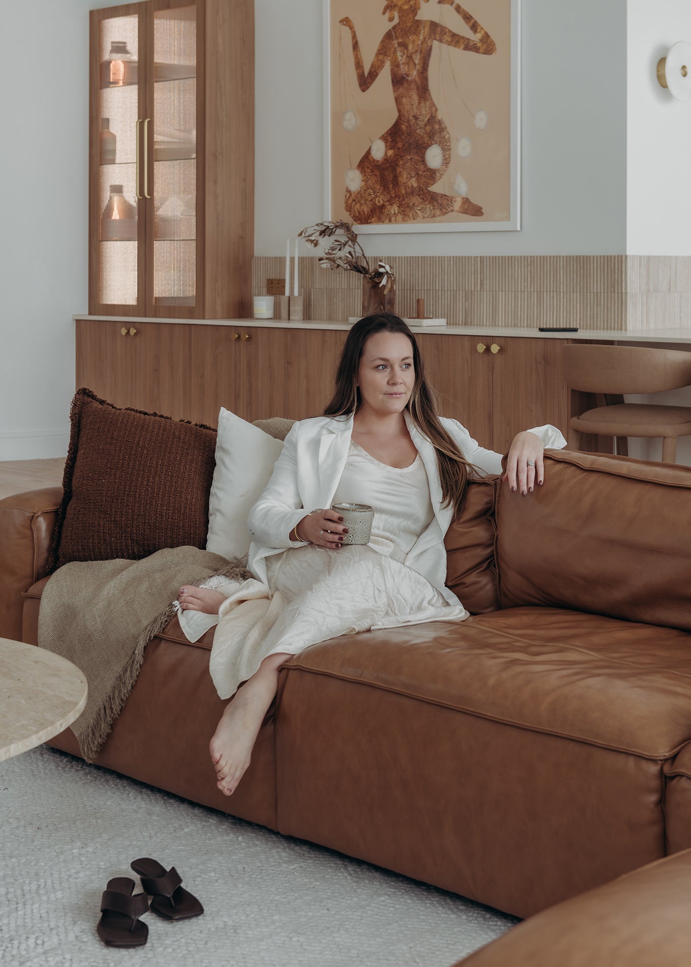
It’s no secret that the rolling hills and stunning seascapes surrounding Byron Bay are now home to an impressive assortment of private luxury homes and boutique getaways. After honing her skills designing the retail space and headquarters for iconic local clothing brand, Spell, Mel stepped out on her own and has been a part of some of the most notable abodes in the region ever since.
Since starting Avenue Twenty – currently a one-woman show that offers both design and decorating services for those wanting to craft something exceptional – Mel has contributed to The Beach House of East Coast, Four Palms Byron Bay, Le Viti Barn, Sipp Coffee and, most recently, The Villa General.
Each space has benefited from Mel’s obvious ability to run with the unique personality and design vision of each client, all the while integrating her proven flair for selecting stunning key elements and combining them with an innovative blend of both earthy and luxury finishes. Primed with a reverence for nature and outdoor living that her community is so well known for, hers is a winning combination that has recently housed items from The Dharma Door collection so very well.

Your career in interior design began while you were employed as a personal assistant for the creators of the eponymous Byron-based clothing label, Spell. How did you come to be involved in the design and decorating of their office space and what did gain from the experience?
I began working with the Spell family a few years earlier and had built strong relationships there. I was the personal assistant to the two directors and business manager when they took on their first project. First was their destination store in Byron Bay, then their Headquarters.
The store project was a very organic transition from PA to project involvement. I started by watching in the wings as the owners were exploring the potential of the space, then I really couldn’t help but throw in my two cents! I’ve always had strong gut instincts and my bosses always made me feel comfortable in stepping forward to voice my opinions and ideas. Fast forward a few meetings and it couldn’t help but be acknowledged that perhaps I had a passion to help bring their brand vision to life. With a great deal of trust, they handed over the reins and we were off!

What came next? Tell us a little about your career path from that point, including some of the most memorable milestones and satisfying moments.
Following the success of our retail store, I was given the privilege to develop the Spell headquarters. This was a large project I took on in conjunction with my PA role. By now I had this feeling that this design path was something I was supposed to be leaning into with my creativity. Once we were in the new office space one of my bosses sat me down, smiled and said ‘so what are you still doing here…you need to go and share yourself with the world’. That's when Avenue Twenty Two was born.
In the four years since Avenue Twenty Two became my full-time focus I have been involved in a mix of both residential and commercial projects, really developed my skills and refined the direction of the business. I jumped straight into the deep end with some very large projects. Now – having completed these and reflecting on what was achieved – I am beginning to acknowledge it is something I should be quite proud of. I am only recently beginning to shake the imposter syndrome that I struggled with for the first few years.

How do you describe your style to others? Although you always work to a client brief, what key design elements always make an appearance in your projects?
I believe a clean base is important for long term evolution. I think if you are investing in a designer the canvas you put down should be open to growing with a client and their life. Clean tones and thoughtful design in terms of functionality and living experience is really important to me. I do like to blend a combination of textures in homes: warm, organic timbers blended with contemporary cooler finishes to give a hint of edge that might be a material like steel, marble, mirror or glass.
Why are you drawn to this approach? Why do you think it works well in interiors?
In providing a contrast of materials, from natural to engineered, earthy to contemporary, I think you start to recognise what makes each component unique, and it helps balance a space. The contradiction in these finishes is what attracts you and draws you into a space.

You obviously have an ability to listen to your clients and develop ways to integrate people’s unique personality and experience into the project. Can you tell us a little more about how you do this and why you think it is important for a project to ring true to the people it is created for?
Getting to know your clients and how they live and work is key to delivering a space that suits their lifestyle. Trust in your designs and knowing you are working for them as their advocate throughout a process is essential. Often this means challenging a thought, raising questions and deep-diving into multiple options throughout projects.
My job is to not only deliver spaces that clients have dreamt about but also to introduce and help educate them on new ideas and developed options to make sure they love their spaces for a long time.

You work in a close-knit, coastal community. How does your surrounding environment influence you and your clients and why do you think the Byron Bay aesthetic makes people feel so good?
The Byron Bay way of living is greatly centred around our natural environment and sense of community which makes our lives very social. My spaces are always incorporating inside-outside potential with a lot of emphasis on entertaining locations, sun aspects and comfort. Trans-seasonal entertaining spaces, natural light, innovation to aid in quality of living are all aspects that enhance how we live in our homes throughout the year and within our Byron Bay surrounds.
You generally stick to fairly earthy and natural colours and tones. Can you tell us a little more about how you select a palette for your project and how this also plays into your product and material selections?
Step one is always evaluating the natural surroundings. It’s a balancing act - too much of something feels overdone, too little can feel stark and soulless. I pick key finishes for large surfaces first, such as walls and floors, then work on refining accents and materials from here to maintain the vision.
I am definitely a fan of less is more, and always quality over quantity. I take the client’s wish list and inspiration onboard, but then always work back to refine and simplify a vision. I prepare samples for clients to make sure they can touch and experience their finishes before committing. I want them to be as excited as me about the vision before taking a leap. When you can lay out your materials and explain the design story it starts the journey in connecting a client to their space.

Thinking about the products you select, you seem to be quite mindful about the decorative objects you choose. Can you share a little more about this and why you think it is important for us to consider where our purchases are made?
I like my clients to have pieces within their spaces that are unique. When you have a respect for a piece and connect to its story, it brings a deeper appreciation to a craft and it often then holds a personal significance. I love and invest energy into trying to curate decorative objects so that a client can proudly take their friends through their space and share the story of how it came to be.
How does this translate to the feeling or atmosphere you create in a space? What should our followers think about when making their interior decor choices?
Anyone can build a house, but to build a home you need connection. Online shopping is easy and increasingly popular once you are familiar with suppliers, but I think about injecting soul when looking for items – you need to have that instinctual physical attraction. Don’t be afraid of items that immediately intrigue you or challenge your thinking.
Also, research your suppliers, their philosophies and practices. What we place in our spaces is a reflection on our self, so it’s important that quality and thoughtful operations are in place.

You also use natural elements and texture in your work. What does this do for the spaces you create?
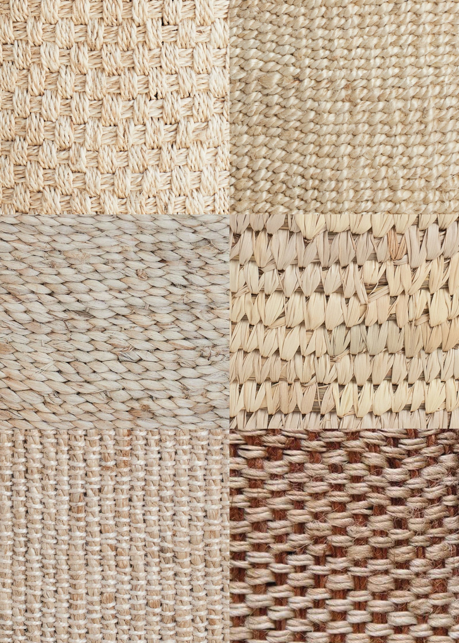
I love a clean palette, but to avoid spaces feeling stark, subtle textures and balanced negative space are important. Variation in finish creates depth and interest, which takes what could be a plain two-dimensional surface into something with soul, warmth and intrigue.
And finally, you have used a variety of items from The Dharma Door collection in your client projects. What drew you to working with these products and how have you used them successfully?
The beautiful range successfully delivers pieces that are both highly practical and aesthetic. Organisation, decorative displays, practical room accents - the soft nature of the fibres compliment my style and their applications are so diverse.
Their quality and traditional craftsmanship means the pieces stay beautiful for years which I appreciate for reducing my footprint. Being nurtured in a company surrounded and supported by women, the support of Fair Trade, not-for-profit NGO groups directly supporting female artisans resonates with my start in interior design.

SHOP THE COLLECTION
Also in Journal
Notify me when available
We will send you a notification as soon as this product is available again.
We don't share your email with anybody


